Responsive website design is no longer a “nice to have.” It is a foundational requirement for digital success. As users shift between mobile phones, tablets, laptops, and large screens throughout the day, websites must adapt seamlessly or risk losing attention, trust, and visibility.
From page speed and usability to search rankings and conversions, responsive website design directly influences how a brand performs online. This article breaks down why responsiveness matters, how it affects performance and UX, and why search engines increasingly favor responsive websites.
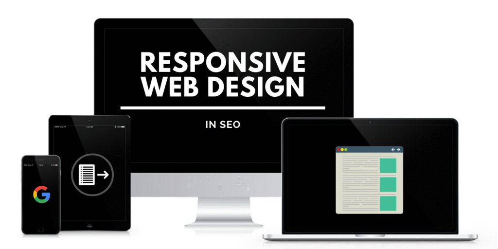
What Responsive Website Design Really Means Today
At its core, responsive website design ensures that a website adjusts its layout, content, and functionality based on the user’s device and screen size. But modern responsiveness goes beyond flexible grids and scalable images.
Today, responsive design also considers:
- Touch-friendly navigation
- Adaptive typography
- Optimized media loading
- Device-specific performance behavior
A responsive site does not simply resize. It responds intelligently to context.
Performance: Why Speed Starts with Responsive Design

Website performance is one of the strongest signals for both users and search engines. Slow-loading sites frustrate visitors and increase bounce rates.
Responsive website design improves performance by:
- Eliminating the need for separate mobile and desktop versions
- Reducing redundant redirects
- Optimizing images and assets dynamically
- Streamlining codebases
Instead of maintaining multiple sites, responsive design centralizes optimization efforts. This leads to faster load times and easier long-term maintenance.
Mobile Performance Is No Longer Optional
With mobile-first indexing, Google primarily evaluates the mobile version of a website when determining rankings. If a site performs poorly on mobile, desktop performance will not compensate.
Responsive design ensures that performance optimizations apply consistently across devices, which directly supports search visibility.
User Experience: Where Responsiveness Makes the Biggest Impact

User experience is where responsive design truly proves its value. A site may load quickly, but if it is difficult to navigate or read, users will leave.
Responsive website design improves UX by:
- Maintaining readable text without zooming
- Ensuring buttons and links are easy to tap
- Preserving visual hierarchy on smaller screens
- Reducing friction in forms and interactions
These improvements lead to longer sessions, higher engagement, and better conversion rates.
Consistency Builds Trust
Users expect consistency. When a website looks and behaves differently on each device, trust erodes. Responsive design provides a unified experience that feels intentional and professional.
This consistency is especially important for brands that rely on credibility, such as service providers, SaaS platforms, and eCommerce businesses.
SEO: How Responsive Website Design Supports Search Rankings

Search engines aim to deliver the best possible user experience. Responsive website design aligns directly with that goal.
From an SEO perspective, responsive design:
- Consolidates content under a single URL
- Prevents duplicate content issues
- Simplifies crawling and indexing
- Improves Core Web Vitals
Google has explicitly recommended responsive design as the preferred configuration for mobile optimization. This makes it a strategic SEO decision, not just a design choice.
Better Engagement Signals
Metrics like bounce rate, dwell time, and pages per session influence how search engines interpret user satisfaction. Responsive design improves these signals by making content easier to consume across devices.
When users stay longer and interact more, rankings benefit.
Accessibility and Inclusivity
Responsive website design also plays a role in accessibility. Proper spacing, scalable fonts, and adaptable layouts make content more usable for people with visual or motor impairments.
Inclusive design practices not only improve UX but also align with modern web standards and compliance expectations. This adds another layer of credibility and trustworthiness to a brand’s digital presence.
Why Businesses Turn to a Web Design Agency for Responsiveness
While DIY tools can handle basic layouts, achieving truly responsive performance requires expertise. A creative web design agency in the USA understands how design, development, and optimization intersect.
Agencies bring:
- Device testing across real-world scenarios
- Performance optimization expertise
- UX research and behavior analysis
- SEO-aligned design strategies
This holistic approach ensures responsiveness is not treated as a checklist item, but as an integrated system.
The Role of Responsive Web Design Services in Scalability
As businesses grow, their websites must scale with new features, content, and traffic. Responsive web design services provide a framework that supports expansion without breaking usability.
Instead of redesigning for every new device or screen size, responsive sites adapt naturally. This reduces technical debt and future redesign costs.
Scalability becomes proactive rather than reactive.
Responsive Design and Brand Perception
Design communicates intent. A responsive website signals that a brand respects its audience’s time and experience. It shows attention to detail and technical competence.
In contrast, poorly optimized sites suggest neglect or outdated practices. In competitive markets, perception alone can influence buying decisions.
Responsive design strengthens brand authority without saying a word.
How Responsiveness Supports E-E-A-T
Responsive website design contributes indirectly but meaningfully to Google’s E-E-A-T framework.
- Experience is reflected in smooth, intuitive interactions
- Expertise shows through thoughtful layout and performance
- Authoritativeness grows with consistent, professional presentation
- Trustworthiness increases when users encounter fewer issues
A responsive site reinforces credibility at every touchpoint.
Common Responsive Design Mistakes to Avoid
Even well-intentioned designs can fail if responsiveness is handled poorly. Common mistakes include:
- Hiding important content on mobile
- Overloading pages with heavy assets
- Ignoring touch-based navigation
- Relying on fixed font sizes
Professional responsive web design services address these issues early through testing and iteration.
The Future of Responsive Website Design
As new devices and interaction models emerge, responsiveness will continue to evolve. Voice interfaces, foldable screens, and AI-driven personalization will all shape how websites respond to users.
The core principle, however, remains unchanged: websites must adapt to people, not the other way around.
Conclusion: Responsiveness Is a Growth Enabler
Responsive website design is not just about fitting screens. It is about improving performance, enhancing user experience, and strengthening SEO simultaneously.
Brands that invest in responsive design see measurable benefits in engagement, visibility, and conversions. Those who delay risk falling behind. Web Design Lane delivers responsive websites built for performance, usability, and search visibility. As a trusted web design agency, Web Design Lane helps businesses create websites that adapt seamlessly, load faster, and convert better. If your website is ready to work harder across every device, responsive design is the place to start.